PROPLINK
Redesigning Trust Through Clarity in Real Estate
Clients
Portfolio Project
Timeline
4 Weeks
Service
Website
Tools
Figma, Figjam & ChatGPT

Project Overview
Proplink is a real estate platform designed to help users discover, evaluate, and confidently inquire about residential and investment properties. Rather than functioning as another listing website, the redesign focused on making property decisions easier by reducing confusion, improving transparency, and establishing trust throughout the search journey.
For users, finding a property is more than a browsing task. It can be a high-stakes financial decision where uncertainty around pricing, location, or property details can quickly lead to hesitation or drop-off.
Role: Sole Product Designer
Timeline: 4 weeks
Platform: Website
Tools: Figma, FigJam & ChatGPT
Responsibilities: Research, strategy, information architecture, wireframing, UI design, visual direction, usability validation

Proplink was designed primarily for first-time home buyers, renters, property investors, and diaspora buyers who rely heavily on digital platforms when evaluating properties. These users typically browse on mobile devices and value clarity, transparency, and speed when making property decisions.
Real estate agents were also an important secondary user group. For them, the platform needed to do more than generate traffic; it needed to help turn browsing into meaningful property inquiries.
Early conversations and observations revealed a recurring pattern: users were overwhelmed by cluttered listings and long blocks of unstructured information. Hidden fees created distrust, while complicated filters made property discovery harder than it needed to be.
The problem wasn't that users lacked information.
They had too much information, without enough structure to help them make sense of it.
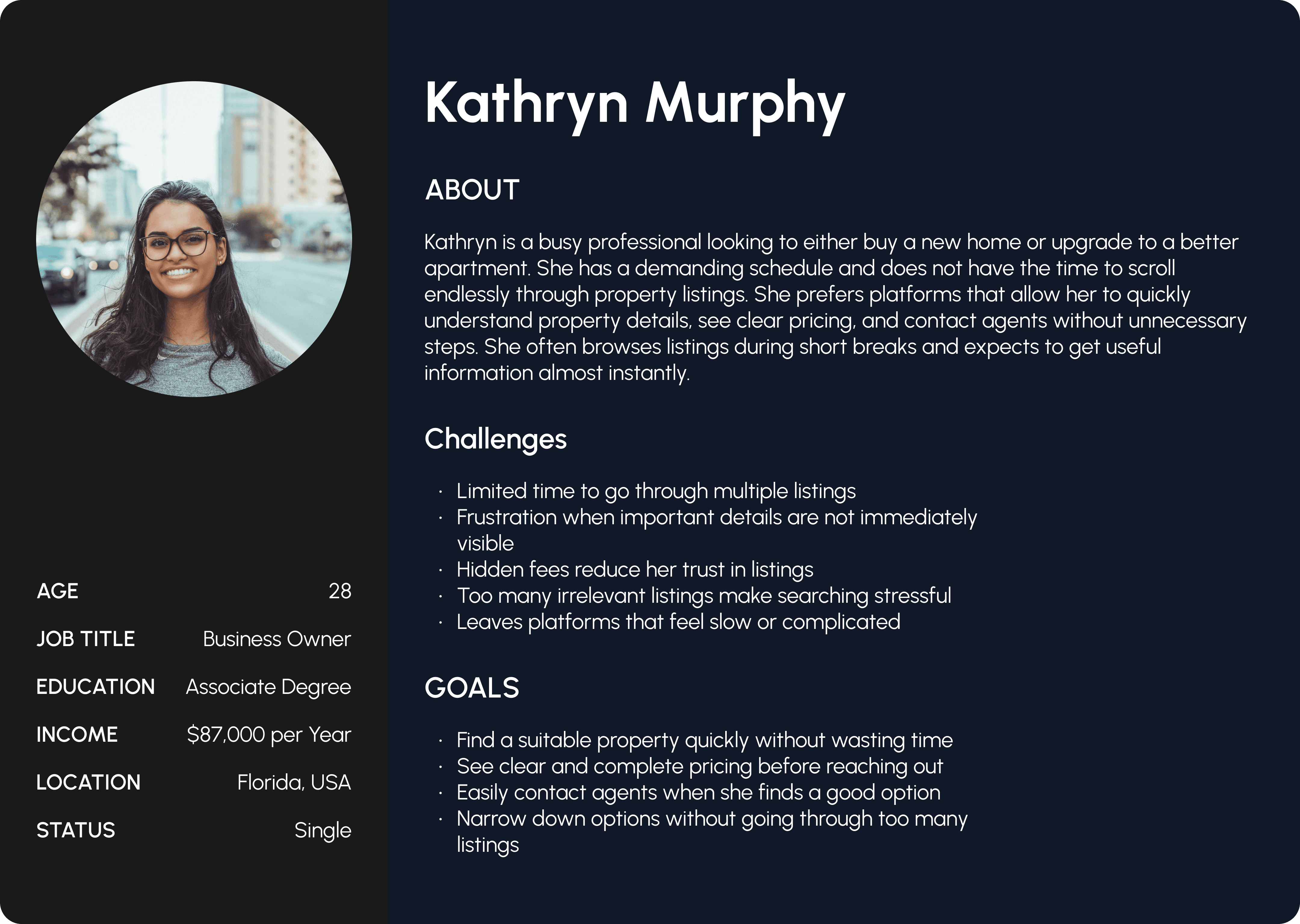
The challenge wasn't primarily attracting visitors. It was getting those visitors to engage meaningfully with listings and eventually contact an agent.
Low inquiry rates and early drop-offs suggested that users weren't always finding enough clarity or reassurance to move forward.
That meant the redesign needed to address two connected problems:
Reduce friction during property discovery.
Establish enough transparency and confidence for users to take action.
Rather than treating conversion as a traffic problem, I approached it as a communication and decision-making problem.

Through early conversations and observation, I explored how people searched for properties, what information they looked for first, and what caused them to hesitate.
Users consistently scanned for price and location before anything else. Hidden fees weakened credibility, while long and unstructured descriptions created mental fatigue.
Other patterns emerged:
Quick summaries made properties easier to understand.
Visible maps increased confidence in location.
Complex advanced filters discouraged engagement.
Users struggled to compare properties efficiently.
Unclear information made the platform feel less trustworthy.
These findings shifted my focus from simply displaying more property information to structuring the right information in the right order.

I used direct yes-or-no survey questions to validate whether the problems identified during the initial research were consistent across a wider group of users.
The responses reinforced several of the earlier findings. A large percentage of users reported feeling overwhelmed by property websites, while unclear pricing was a significant reason for abandoning listings.
Users also indicated that advanced filters could be confusing and that clearer summaries and transparent fees would increase their confidence when deciding whether to contact an agent.
The research pointed toward a clear principle:
Users didn't necessarily need more information. They needed information that was easier to understand and trust.

I compared Proplink with established real estate platforms including Zillow, Rightmove, and Realtor.com.
These platforms offered strong filtering capabilities and large volumes of listings, but the experience often relied on dense information blocks and limited upfront transparency.
The comparison revealed an opportunity for Proplink to compete differently.
Instead of trying to win through the quantity of information, Proplink could differentiate through the quality and structure of information.
This became the foundation for the redesign:
Make property decisions clearer, not simply more feature-rich.

The research and competitive analysis led to four design priorities:
Important information was buried → Surface critical details earlier.
Pricing created distrust → Make fees and costs transparent.
Listings were difficult to scan → Create a stronger information hierarchy.
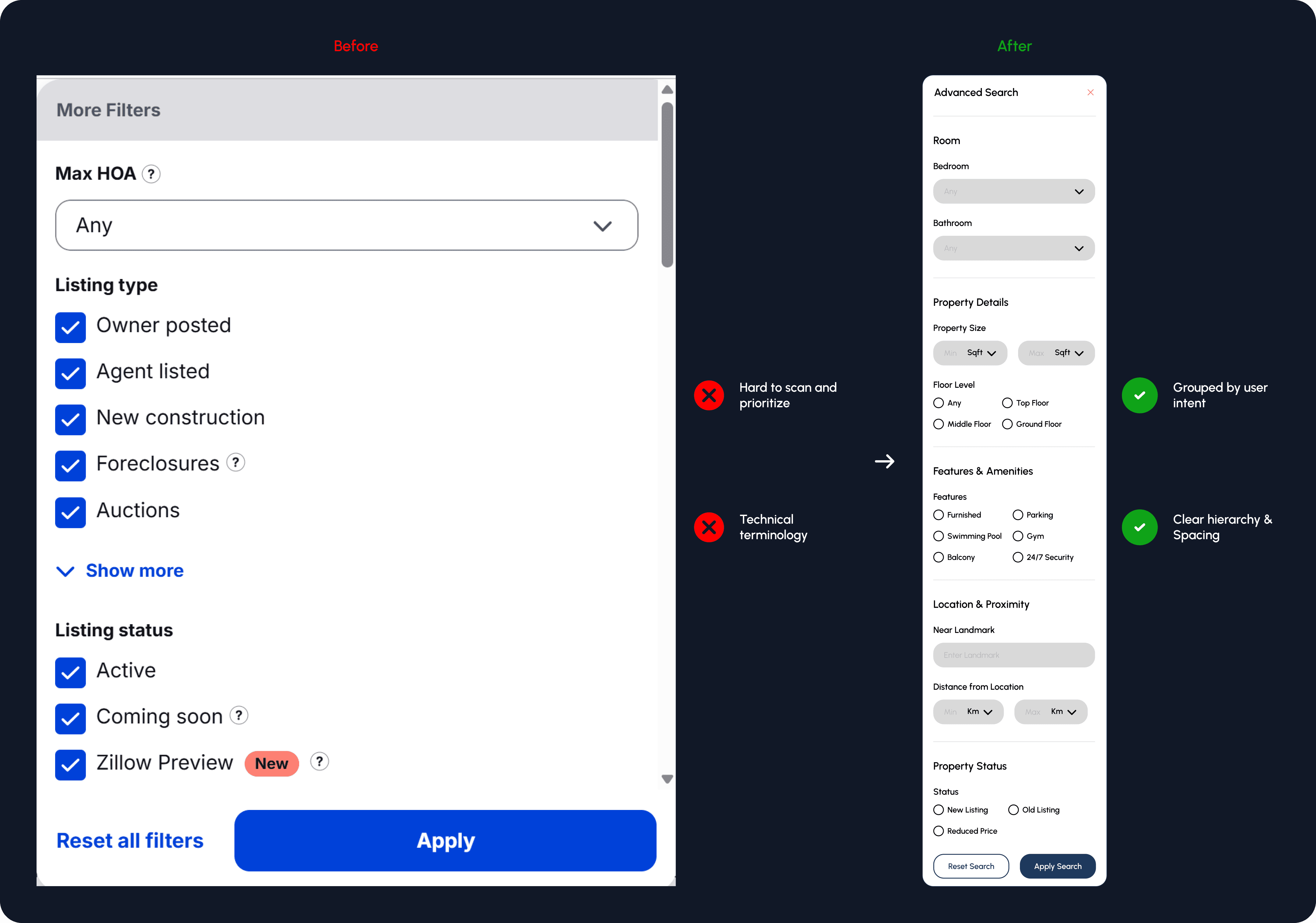
Advanced filters felt complicated → Simplify and group related filters.
This meant the redesign wasn't about adding more functionality.
It was about removing unnecessary effort from the decisions users were already trying to make.

I redesigned the property page around the sequence in which users naturally process information.
The most important details appear first:
Property name → Location → Key highlights → Price → Fees → Details
This allows users to understand the essentials before committing to longer descriptions or deeper property information.
From there, features, specifications, maps, videos, and structured descriptions provide additional context for users who want to evaluate the property more deeply.
The visual hierarchy was deliberately designed to support both quick scanning and informed comparison.

One of the strongest research findings was the effect of unclear pricing on trust.
Instead of allowing users to discover additional costs later, pricing and fee information was brought closer to the beginning of the property experience.
The goal was simple:
Show users what they need to know before asking them to take action.
This approach turned pricing from a potential source of uncertainty into part of the platform's trust-building experience.

Advanced search was another area where complexity created friction.
Rather than presenting users with technical or overly detailed filtering options, related filters were grouped together and terminology was simplified.
The goal wasn't to remove control.
It was to make that control easier to understand.
This allowed users to narrow down properties without having to learn how the platform itself was organized.

The visual direction followed the same principle as the UX:
clarity over decoration.
Typography, spacing, grids, color, icons, imagery, and content hierarchy were used to establish clear relationships between information rather than simply making the interface look minimal.
The result was a structured visual language that allowed important property information to stand out without overwhelming the user.

I tested the redesigned experience through moderated usability sessions using realistic tasks.
Participants were asked to:
Find a property within a specific budget.
Compare listings.
Identify total costs.
Contact an agent.
Users completed search and inquiry tasks noticeably faster, with an estimated 30–35% improvement during the moderated testing sessions.
Participants also described the experience as clearer and easier to navigate, suggesting that restructuring the information hierarchy improved usability and decision confidence.

Real estate decisions can be financially significant, yet users often interact with property platforms quickly, particularly on mobile.
That created a tension:
The product needed to communicate enough information for a high-stakes decision without making users read through everything before they could act.
I addressed this by prioritizing critical information, reducing unnecessary reading, and establishing trust before prompting users toward an inquiry.
The design therefore favored structured minimalism over decorative complexity.

The redesign brought together the research findings, information hierarchy, simplified search, transparent pricing, and clearer property presentation into one experience.
The intended impact was to:
Reduce early drop-offs.
Increase listing engagement.
Improve inquiry clicks.
Increase confidence during property evaluation.
Make the path from discovery to inquiry more direct.
The usability sessions provided early evidence that the redesigned experience made key tasks faster and the information easier to understand.

This project changed how I think about trust in digital products.
In real estate, visual polish alone cannot make users feel confident. Trust is built through the information users receive, the order in which they receive it, and how easily they can understand what they're being asked to decide.
The biggest lesson was that clarity is not simply a visual quality, it is a product strategy.
When information hierarchy, transparency, and usability work together, the interface does more than display properties.
It helps people feel confident enough to make a decision.

Open to full-time roles, freelance projects, and meaningful collaborations — contact me.